Case study / Brand system
One system. Every surface.
This is the brand system I use for my own work. I rebuilt it from a site that looked busy and read badly into a small kit — one wordmark, six colors, one type family and a handful of components — that every page, file and post is built from.
- Client
- Self-initiated
- Year
- 2026
- Role
- Identity, design system, web build
- Built in
- Next.js, Tailwind CSS
- Delivered
- Wordmark, jrs. mark and favicon · Color tokens with contrast ratios · Type scale · Buttons, filters, cards and forms · Website, desktop and mobile
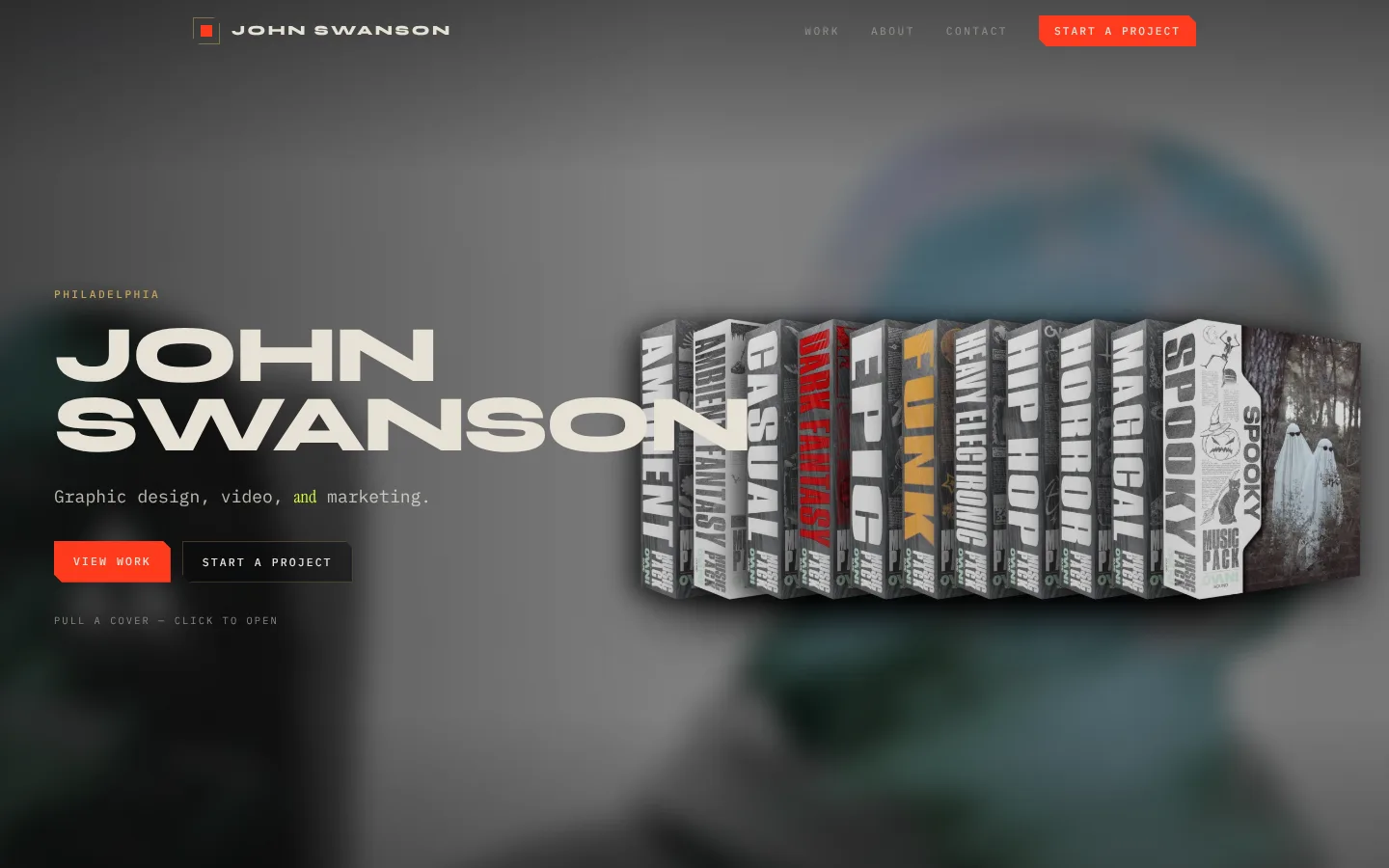
Before
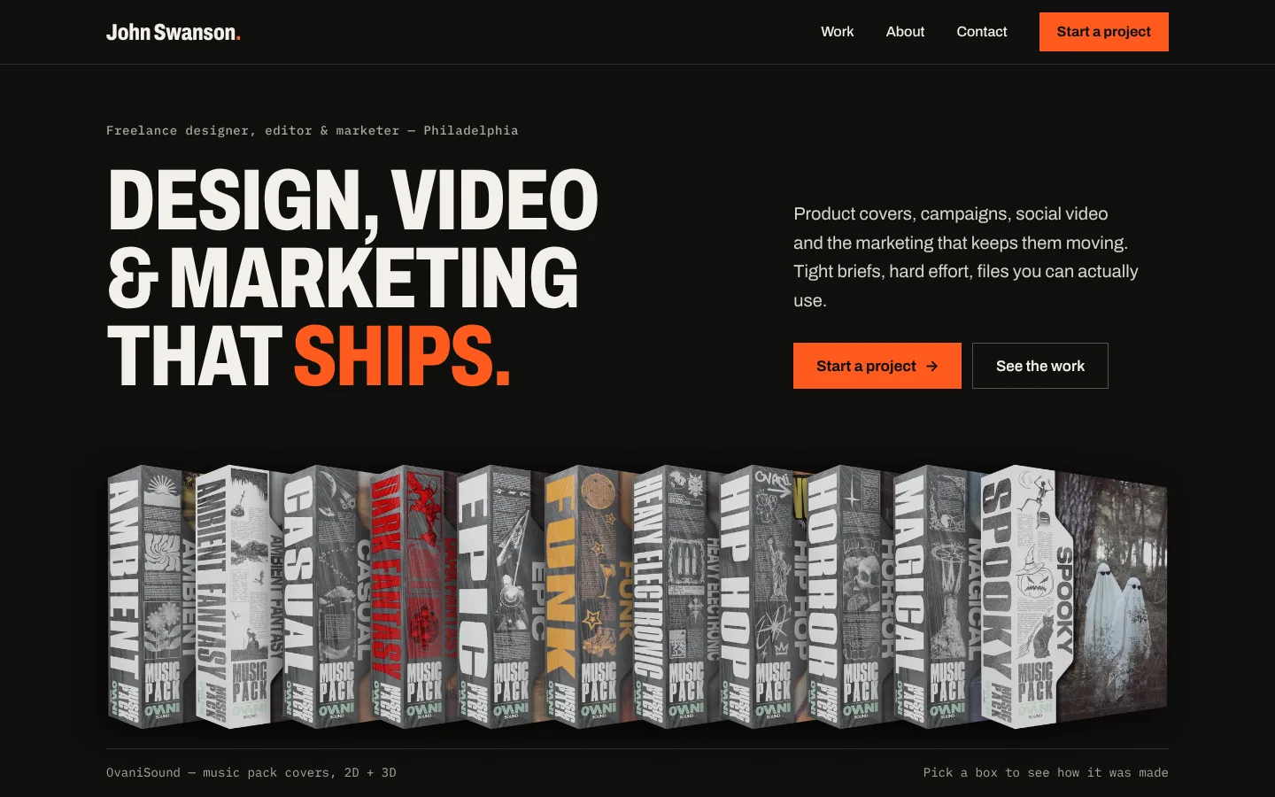
After
01 / The problem
Loud, but hard to read.
The old site had plenty of personality and no system. Each page made its own choices, so nothing looked related and the work competed with the decoration around it.
4
accent colors
Ember, lime, gold and steel each did a different job, so none of them meant anything.
3
typefaces
A wide display face, an italic serif and a monospace for body text competed in every heading.
10px
smallest labels
Spaced-out monospace capitals carried navigation, kickers and hints at 10–11px.
2.2:1
lowest contrast
Hint text failed WCAG AA, and light text on the orange buttons only reached 2.7:1.
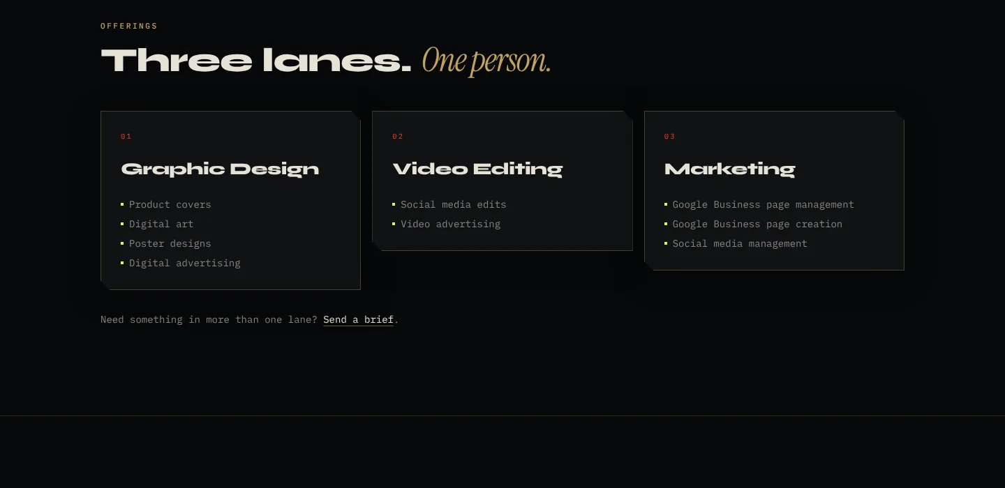
02 / Principles
Four rules, written down.
01
Two grounds, one accent
Ink is for showing work, paper is for reading. Signal orange is the only color that asks for attention, so it goes on calls to action, results and the dot.
02
One family, one utility
Archivo does everything from 130px condensed headlines to 17px body text. A monospace is kept for metadata only, in sentence case.
03
Proof up front
Results are set as large as headlines. A client should see what the work did before reading what it was.
04
Readable by default
Every text pairing passes WCAG AA, body text never drops below 17px, and every target is at least 44px.
03 / The system
Small enough to remember.
Name & mark

The wordmark is my name, set in Archivo Condensed and closed with the orange dot. It matches johnswanson.co, and it's what clients search for and pass on. My initials, jrs., are the mark: the favicon, profile images and the signature on files. I tried a studio name built from those initials first and dropped it — people hire a person, and a name that looks like a web address has to be one you own. The dot carries across all of it, plus active navigation and numbered sections.
Color
Ink
#0F0F0D
Showcase ground; text on paper
16.9:1 on PaperInk 2
#1A1A17
Cards on ink
Line #2E2D29Paper
#F3F0E9
Reading ground; text on ink
Line #D3CEC2Signal
#FF5A1F
Calls to action, results, the dot
6.2:1 with InkStone
#A9A59C
Secondary text on ink
7.8:1 on InkSlate
#55534D
Secondary text on paper
6.8:1 on Paper
Each color is a CSS token with its contrast ratio written next to it. Orange is never used for small text on paper; a darker #B83D0E (5.0:1) covers that case.
Type
Display Archivo 800 · 72% width · caps 56–132px · line height 0.9
Proof, not pitch.
Title Archivo 700 28–40px · line height 1.1
RyzaGrow — DTC campaign
Body Archivo 400 17–22px · line height 1.55
Campaign management, content and social direction for a direct-to-consumer mushroom grow kit. Owned media across product and web.
Meta IBM Plex Mono 400–500 13–15px · sentence case
02 / Selected work · Ryza, LLC · Design + Marketing
Components
OvaniSound · Design30 in 1 week
75+ music pack covers
Square corners and one-pixel rules instead of the old angled corners. Video is marked with a “Play” tag rather than a second color, so the accent keeps one meaning.
04 / Applied
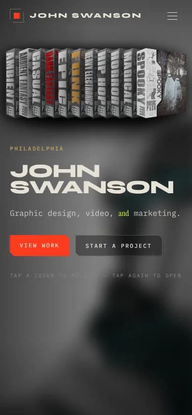
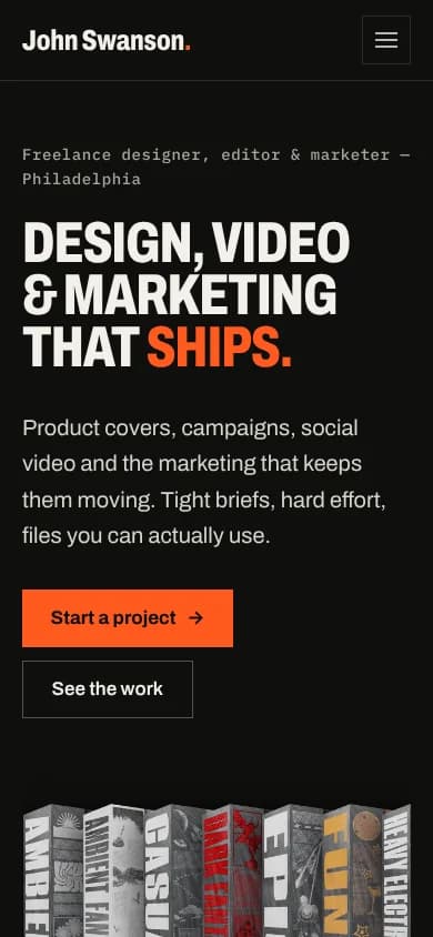
Same kit, desktop to phone.
The phone layout isn't a separate design. It uses the same tokens and components, and the headline still leads with the offer.
1
accent color, down from four
2
type families, down from three — one for everything you read
AA
contrast on every text pairing, from 2.2:1 at the lowest
Want a system like this?
I build the same kit for brands: a wordmark, a palette that passes contrast, a type scale and the components to use them — handed over as files and tokens your team can actually use.